Tuesday, December 14, 2010

Try a New Technique

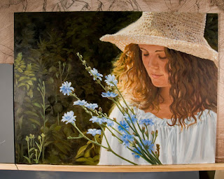
So here is a new technique I tried called, peinture à l'essence. It was a technique developed by Edgar Degas to mimic the look of pastel but because it is painted using traditional oils, it does not require the protective glass in the framing. Although Degas abandoned it, Henri de Toulouse-Lautrec adopted it and used it the rest of his career.

It starts with using a piece of cardboard for a palette. This allows the oils in the paint to be wicked away into the porous board. The artist uses turpentine to get the drier paints to the right consistency and then the panel (an unprimed, untempered hardboard or chipboard) is painted using more of a pastel technique. In this technique one is not supposed to "paint" with the brush but rather draw with various layers of color. The paint dries almost immediately allowing you to continue with the next layer.

Although mine is perhaps more textured than some, I found I really liked this technique.

Monday, December 6, 2010

Posting a Bit of Inspiration

My brother sent me a link for this new animated short by Ryan Woodward. It just got turned down by Sundance Film Festival and he's feeling a bit bummed - Show him the love! This is amazing!!!

Thought of You from Ryan Woodward on Vimeo.


Thought of You - Behind the Scenes Preview - ROUGH CUT from Cambell Christensen on Vimeo.

Friday, December 3, 2010

Be Creative - With Yourself!

Having trouble coming up with new ideas? Have you found that all your fantasy/mythological creatures look the same? Then try using better reference - like you!

The challenge: Create a self portrait but combine animal references to make a brand new you.

I started with a photo I had taken of a European Goshawk (my favorite hawk).
Then I had a friend take a photo of me in the same lighting as the hawk (or as close as we could manage).
So then I looked through my files (in particular recent trips to the zoo) for other animals that had a similar lighting scheme and pose. I found this camel.
And this alligator was in the right ball park
So next - find the most creative way to mix them all together. My effort is found below.
My sons came up with a great name for this creature - CHAD! It stands for Camel, Hawk, Alligator and Dad :)

Monday, October 25, 2010

SCBWI-WI Illustrator Contest - Part 5

With the adjustments in place I grabbed my piece and headed for Racine, WI (by way of Madison to pick up my brother who was coming along). I am so grateful I took the time for the last minute changes. The piece was well received and spoken of enthusiastically. And if it garnered some modest award, you didn't hear it from me.
I'm quite anxious to see what the contracted illustrator of the book will do with this scene. I can't see this scene any other way. Hope you like it and keep an eye out for "Seed Magic" when it is released from Peachtree Publishers.

Saturday, October 23, 2010

SCBWI-WI Illustrator Contest - Part 4

Having transferred the drawing onto a piece of double thick illustration board (via projector), I fine tuned it, sealed the board with acrylic matte medium and got to work.

I spent a full day painting and when I was done I had a problem: a major color (the bricks) were competing with and drowning out my other elements. I had painted the bricks to be warm, like the setting sun was illuminating them. The birds were supposed to jump out but instead they could not compete with the bright wall. So I scanned the image and tried some possible solutions in Photoshop. Below are the two options I settled on.
The answer was to go with the first option and so early the next morning, hours before I had to leave for the SCBWI retreat with my finished piece in hand, I began to make the necessary changes.

Friday, October 22, 2010

SCBWI-WI Illustrator Contest - Part 3

Next, in Photoshop I tried out some color ideas. These color sketches were done on separate layers so that I could make adjustments easily.
At this point I still have the street lamp in the lower left hand corner but as I approach the final piece I will decide that it is more of a distraction than a help in the composition.

SCBWI-WI Illustrator Contest - Part 2

So after the thumbnail is chosen, I enlarge it and print it out on a 8.5 X 11 sheet of paper and prepare to carefully figure out the perspective. I used a portable drafting board and basic triangle to set things up. I knew from experience that if I tried to fudge this compositions perspective I would destroy the illusion I was trying to create, so I was very careful to measure and place the elements as accurately as I could.
I drew the building first working out the various shapes including the perspective on the brick pattern and then I drew the birds separately, scanned them and laid them out in Photoshop. That gave me the freedom to resize and rotate as I needed. I chose birds to work with the manuscript call out for red, yellow and blue.

I didn't feel like this was a kind of story to make up Dr. Suess type fantasy birds. I wanted to show how beautiful real bird species you might find in a city can be if you are willing to see them. That said, I will admit that I have added two bird species that would not be attracted to seeds - they're insectivores. Can you guess which they are?

Thursday, October 21, 2010

SCBWI-WI Illustrator Contest - Part 1

This is the second year that we have done this in our WI chapter of the SCBWI. I wasn't able to attend last year so this is my first year participating. Each illustrator was given 2 manuscripts that are currently being worked on for publication by Peachtree Publishers. Of the two, I chose one called, "Seed Magic" by Jane Buchanan. It's about a girl who wishes for a garden of beautiful flowers but, living as she does in the inner city, she has no place to plant it. A local character, the "Bird Man," an elderly wheelchair bound man with a love for the birds, gives the girl some of his seeds declaring that they are magic seeds and that if she puts them on her window ledge she will have her garden. Uncertain how that would be possible, she exercises a little faith and does as she was instructed. To her delight she finds herself surrounded, not with a garden of flowers but of beautiful birds of red, yellow and blue.

That last moment was the scene I wished to capture. The manuscript described that the Bird Man was watching this all unfold from the sidewalk and glorying in her delight. The manuscript suggested that the scene be shown from the Bird Man's point of view but I could not understand how that could be effective - no... I had to see the scene from the sky.
Here is the thumbnail I chose. Normally I try to do multiple thumbnails but in this case, I really knew that this was the layout I wanted.

SCBWI-WI Fall 2010 Fall Retreat

This was only my second time to a SCBWI (Society of Children's Book Writers and Illustrators) retreat and this one was even better than the last. We have an amazing group here in Wisconsin and our retreat featured some wonderful guests. I can only speak to the presenters I was privileged to see but:

Bruce Hale was entertaining and informative. I have been working on a novel (a story for another time) and his thoughts on creating suspense were very helpful to me. Also a very pleasant fellow.

Lisa Yoskowitz was wonderfully knowledgeable and approachable. As an editor for Dutton books she talked in great detail about how to pitch your book effectively and understand the publisher (how to "think like a publisher" to quote Lisa). I was very grateful for her candid approach and she was very generous with her time.

Loraine Joyner, art director from Peachtree Publishers, was an absolute treat for me (being an illustrator and all). Her presentation explored the process of the creation of the illustrations for
the book "Saturdays and Teacakes" by the artist, Chris Soentpiet. Wow! I wish that was available in video form. Chris actually drove from NY to Alabama (I think it was) to come to the author's home town (which was the setting for the book) and spent a couple weeks there creating references to more carefully capture the author's memories (which is the basis for the story). It was really amazing to see the pages evolve from the thumbnails to the sketches to the final drawings and, at last, the paintings.

Another treasure was the time that Loraine took with each of us at our portfolio critiques. I expected a glace over the work and then to discuss some general themes about my work. Instead, virtually each piece was carefully examined and discussed. I was very grateful for her comments.

Now we get to Mary Kole. If there was one of presenters that I felt I really hit it off with, it was Mary. On a personal note, her personality reminded me of a dear friend from HS so I am certainly biased. Outside of that, she was smart, well-read and had the greatest snarky, sarcastic sense of humor. Her presentation on getting an agent (which she is well qualified to talk about since she is one) was very informative, with lots of examples from children's literature. She is also an excellent reader - a great sense of voice for narration or for the character without sounding fake.

Mary was a fan of the piece I entered into the illustrator's contest (which could also make me biased). What? I haven't told you about the contest? Let's make that the subject of next time and I will take you through the process of it's development.

Monday, August 30, 2010

Hunger Games Part 3

So my goal to get this piece done in time for the release of the final book was not met. "Mockingjay" was excellent though and an appropriate wrap-up to the series. I couldn't put the book down once I got to the last half!

So this is the next step in the piece. I used Photoshop to do some color sketching and create a rough sense of where I wanted the foliage to be. I wanted to create a sense of Katniss looking out from the shadows of the trees - I wanted her to look a little dangerous and mysterious.

Tuesday, August 10, 2010

Hunger Games Part 2

Sorry for the break. I was out for a bit of surgery but back and ready to go.

So let's get back to the Hunger Games piece. The new book, Mockingjay, comes out on the 24th and for fans of the series, like me, we can't wait.When I posted last about it, here, I was just creating some sketches of Katniss. Since that time I made some additional thumbnails of how I might like to compose the portrait.With these scribbles I was ready to shoot some references. I had just the right model (she's even 16) and location in mind. The shoot was a great success except for the hoards of mosquitoes. It was unbelievable. I really like much of the pose but there are some things I will have to fix. I captured the mood I was hoping for though and I included the elements of water and woods.
Next up will be to get into Photoshop and sketch in some foliage to create the framing planned in the thumbnails.

Tuesday, July 20, 2010

Photographing Art


Since the discussion about photographing art at a museum, a couple of you have asked about photographing artwork with less than ideal lights and camera. It just so happens that I am also a professional photographer (a small sampling of my work is here) with a full studio of lights and various do-dads but there is a lot an artist can do to get nice shots of their work without all that.

The worst type of art to try to photograph is textured, glossy and dark. Shooting those types of pieces deserves it's own post. For this post let's assume that you are going to shoot an average piece with limited equipment. Here are the most important things to have:

1. Even lighting (don't just put light on one side of the piece). Outdoor shade lighting (like just inside an open garage or in the shade of a building is ideal) can be a very inexpensive way to light your work.
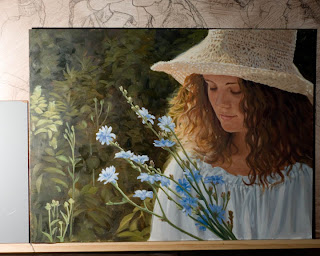
This is an example of a light just used on one side of the art

2. Unicolor light - it's the easiest to lockdown a color balance with a single color lightsource. So for example, tungsten, shade, fluorescent, etc.

3. Any digital camera with a clean lens. Almost all digital cameras have white balance (WB) presets but it is most preferable to have the option for Custom WB. Check your manual to find out how to access the WB settings.

Also a tripod is very useful but not essential and a Gray Card can be helpful but I will mention more about that below.

The quality in modern point-and-shoot (P&S) cameras is quite remarkable so don't feel bad if that is all you have. I heard Donato Giancola say in a lecture to the Society of Illustrators that he would shoot his paintings for use on book covers with a P&S. The most important thing is learning how to use it properly. Here are some notes on important considerations for photographing your art:

1. Know how to properly set your white balance for your light source.Example of bad WB

2. An ideal lens for photographing your work is a 50mm lens but since the average P&S has a zoom lens, the safest bet is to get back away from your art and zoom forward. If you are too close, you risk creating a fish-eye effect, curving the lines of your art in a convex arch. So stand back and zoom in.Example of Fish-Eye effect

3. Give yourself enough light so that you can keep your ISO fast (like 100) and your shutter speed high (like 1/125 sec or higher). This will help keep your images crisp.

Gray Card Technique:
If you still are having issues with color, try this. Get a 18% gray card from a photo supply store and place it next to the art so that it receives the same light as the art. The photograph the art and make sure to include the card in the picture.

In Photoshop go to Levels (Image>Adjustments>Levels) and using the middle eyedropper tool in the Levels window, click on the gray card in your image and the image color should adjust to the right WB for your lighting (or something pretty darn close). Then click OK and crop your art image to taste.
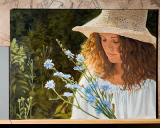
I hope these techniques are useful to you. If you would like to read a much more involved article, this one I found is quite good.

Thursday, July 15, 2010

Hunger Games Part 1

I recently read the book, "Hunger Games," by Suzanne Collins and I loved it. I couldn't put it down. It had flavors of everything I like in an adventure: post-apocalyptic society, life and death struggles, warriors outsmarting one another, and even a little romance. It was so much fun to read that I decided to take a little time and paint a couple of portfolio pieces based on the book.

In this and the coming entries I will take you through how I would approach a project like this.
First comes trying to figure out some ideas - what scene/character do I want to describe. For me, I want to do a hero piece for Katniss first. She's a survivor - a strong and focused character. So I make some character sketches and start to think about what poses would work.

Next time: Narrowing down and picking which sketch to develop.

Gerome and color reproductions

Well, let's get started on this new blog. I was just catching up at my favorite art blog, GurneyJourney, and saw the announcement and critique of a show at the Getty Museum of the work of Jean Leon Gerome. Gerome has long been an artist I have admired for his epic scenes and dramatic (even cinematic) lighting. But my favorite image of his has always been Pygmalion and Galatea, an image that captured my imagination, even from a young age, of artwork coming alive!It wasn't until 2007 that I first got to see the original at the Metropolitan Museum of Art in NYC. Seeing the original work surprised me in two ways:

One: It was a lot smaller than I expected. Surrounded as it was by so many large and grand pieces it was easy to miss.

Two: The colors looked nothing like what I had seen in the various books. I had looked at quite a number of reproductions in books and they usually differed from one another (that's to be expected) - but the original was SO different! It was amazing to see the original work!

In James Gurney's blog he links to a site, JeanLeonGerome.org, which apparently has images of all of Gerome's works. I was mortified to see the classic bad reproduction representing the Pygmalion piece on the site. So, for anyone who is interested, here you can see the original (on the left) and the bad, but all too common, version on the right.

Quite a difference, eh?

During my visit to the Metropolitan Museum of Art, I asked and got permission to bring a tripod around and photograph various pieces around the museum. I carefully set my white balance and exposure to take the best images possible. I could also take closeups of certain areas for study at home.

Many museums will allow you to do this so ask ahead of time. Some have a policy of absolutely no photography and seem scandalized when I ask. Others are delighted that I care so much for these pieces and want to study them. So the take home message is - don't be afraid to ask (calling ahead is best) and you may have a real treasure of quality images to enjoy and learn from in the comfort of your home.

If anyone is interested, here is a link you can click on to get the full-sized file of the Pygmalion piece. If anyone is interested in my closeup shots just drop me a line.


Tuesday, May 25, 2010

Welcome to the new blog!

For those of you who have been following me on my SonsOfMosiah.com art blog - Welcome. This will be me new hub to discuss life in the studio - an appropriate name for a blog such as this.